progressive blur in css
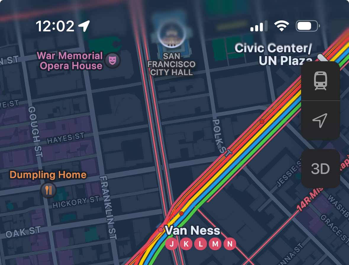
progressive blur is a type of blur effect that blurs an object or background with gradually increasing strength. it is heavily used in apple’s design, such as the status bar when the maps app is opened:

in this guide, i will show you how to achieve the same effect in css!
how it works
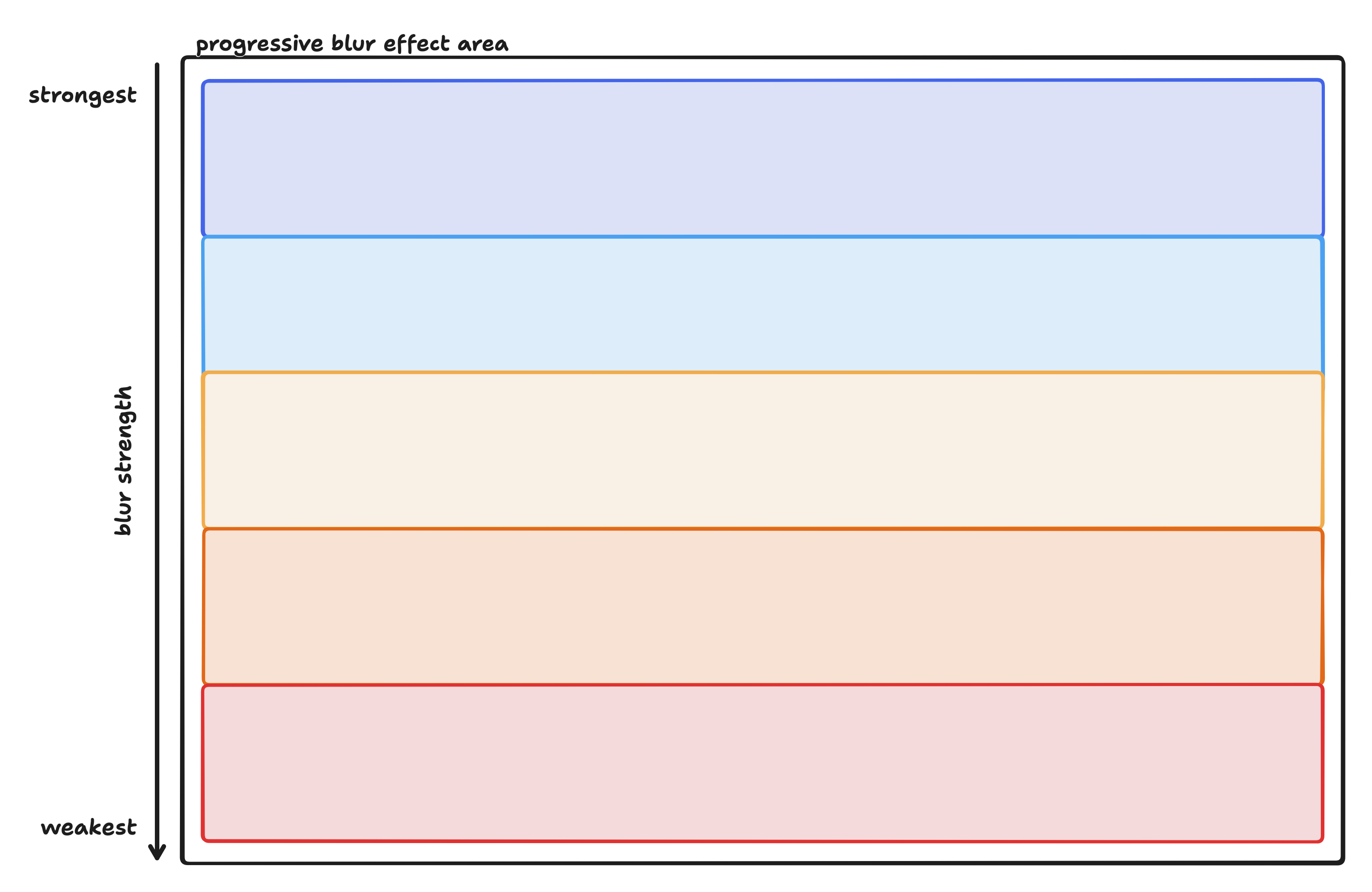
progressive blur can be broken down into segments of blurs that increases in strength. here is an illustration that roughly breaks down the progressive blur found in the example above:

each colored rectangle represents an area with a specific blur value, ordered from the strongest blur value to the weakest, top to bottom. each rectangle slightly overlaps each other so that the blur can transition from one value to another seamlessly.
while i used 5 rectangles in the illustration, in practice, the number can vary, depending on the exact effect you wish to achieve. 5 is a good number to start, but you can tweak the number to your liking. in fact, this goes for every number used in this guide - they are the result of countless hours spent on tweaking to my liking. please feel free to tweak those numbers to suit your preference.
all that’s left to do is to map that illustration into html and css!
laying out the structure
the html structure is straightforward. we want a div that contains 5 divs on top of each other. you will find out the reason why the divs aren’t stacked in a column soon, but for now, bear with me:
<div class="progressive-blur-container">
  <div class="blur-filter"></div>
  <div class="blur-filter"></div>
  <div class="blur-filter"></div>
  <div class="blur-filter"></div>
  <div class="blur-filter"></div>
  <div class="blur-filter"></div>
  <div class="blur-filter"></div>
</div>
this is the css to lay them out correctly:
.progressive-blur-container {
  position: absolute;
  left: 0;
  bottom: 0;
  right: 0;
  width: 100%;
  height: 50%;
  pointer-event: none;
}

.progressive-blur-container > .blur-filter {
  position: absolute;
  top: 0;
  left: 0;
  bottom: 0;
  right: 0;
}
since progressive-blur-container will sit on top of the content, pointer-event: none; needs to be applied so that it doesn’t block any pointer event to the content.
onto the blur effect
as illustrated above, there needs to be different sections of blurs, each with a specific blur value, slightly overlapping each other. concretely, each section is a div that takes up the whole progressive blur area. to only blur a specific area within a section (and transparent for the rest of the section), we can use a combination of mask and linear-gradient. using this combo, rgba(0,0,0,0) maps to transparent, and rgba(0,0,0,1) maps to the blur effect. we can then control where the blur effect starts and ends by specifying the position of rgba(0,0,0,1) within the linear-gradient.
let’s start with the first section which has the weakest blur:
.progressive-blur-container > .blur-filter:nth-child(1) {
  backdrop-filter: blur(1px);
  mask: linear-gradient(rgba(0, 0, 0, 0), rgba(0, 0, 0, 1) 10%, rgba(0, 0, 0, 1) 30%, rgba(0, 0, 0, 0) 40%);
}
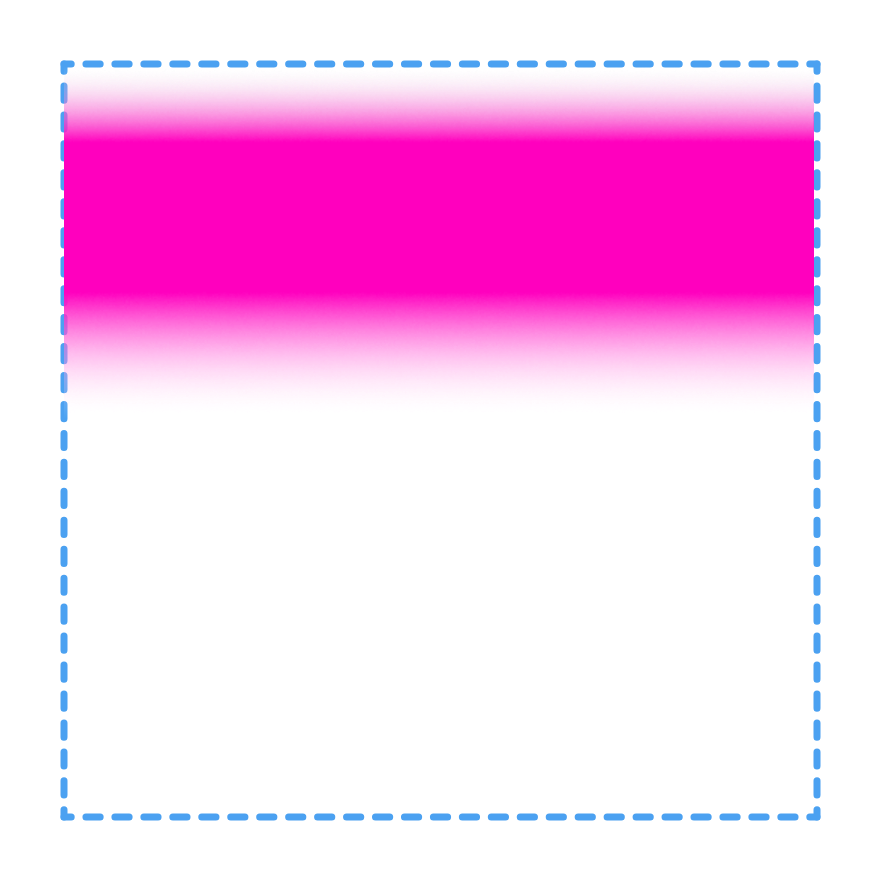
here, we are specifying that the blur area should start at 10% of the div and end at 30%, and we want the effect to end at 40%. here is an illustration, where the pink color represents where the blur effect is:

then, for subsequent sections, we just need to adjust the percentages so that each subsequent section stacks like what’s shown in the illustration:
.progressive-blur-container > .blur-filter:nth-child(2) {
  backdrop-filter: blur(2px);
  mask: linear-gradient(rgba(0, 0, 0, 0) 10%, rgba(0, 0, 0, 1) 20%, rgba(0, 0, 0, 1) 40%, rgba(0, 0, 0, 0) 50%);
}

.progressive-blur-container > .blur-filter:nth-child(3) {
  backdrop-filter: blur(4px);
  mask: linear-gradient(rgba(0, 0, 0, 0) 15%, rgba(0, 0, 0, 1) 30%, rgba(0, 0, 0, 1) 50%, rgba(0, 0, 0, 0) 60%);
}

.progressive-blur-container > .blur-filter:nth-child(4) {
  backdrop-filter: blur(8px);
  mask: linear-gradient(rgba(0, 0, 0, 0) 20%, rgba(0, 0, 0, 1) 40%, rgba(0, 0, 0, 1) 60%, rgba(0, 0, 0, 0) 70%);
}

.progressive-blur-container > .blur-filter:nth-child(5) {
  backdrop-filter: blur(16px);
  mask: linear-gradient(rgba(0, 0, 0, 0) 40%, rgba(0, 0, 0, 1) 60%, rgba(0, 0, 0, 1) 80%, rgba(0, 0, 0, 0) 90%);
}

.progressive-blur-container > .blur-filter:nth-child(6) {
  backdrop-filter: blur(32px);
  mask: linear-gradient(rgba(0, 0, 0, 0) 60%, rgba(0, 0, 0, 1) 80%);
}

.progressive-blur-container > .blur-filter:nth-child(7) {
  z-index: 10;
  background-filter: blur(64px);
  mask: linear-gradient(rgba(0, 0, 0, 0) 70%, rgba(0, 0, 0, 1) 100%)
}
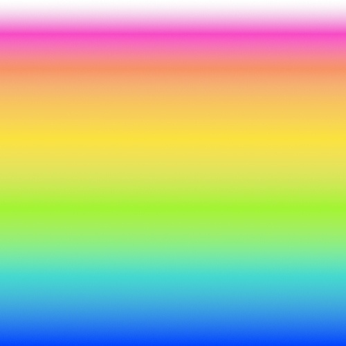
each blur section overlaps the previous section to allow the blur to seamlessly transition. if we represent each blur value as different colors, it would look like the following:

pretty, isn’t it? now imagine the blur getting progressively stronger as the color goes from pink to blue, with each intermediate color representing different blur strengths. what does it look like in action?
testing what we have
the following html code displays a long, scrollable text to demonstrate the progressive blur:
<div class="container">
  <p>replace me with really long text</p>
  <div class="progressive-blur-container">
    <div class="blur-filter"></div>
    <div class="blur-filter"></div>
    <div class="blur-filter"></div>
    <div class="blur-filter"></div>
    <div class="blur-filter"></div>
    <div class="blur-filter"></div>
    <div class="blur-filter"></div>
  </div>
</div>
some additional css:
.container {
  position: relative;
  width: 500px;
}

p {
  height: 300px;
  overflow: scroll;
}
if you have followed each step correctly, you should see a really nice blur effect at the bottom of the paragraph.
hiding the blur “glitches”
you may notice that when you scroll, the bottom of the blur area starts “glitching” and becomes really distracting:
to solve this, we can add a background gradient that goes from transparent to the color of the page, which is #ffffff in this case:
<div class="progressive-blur-container">
  <div class="blur-filter"></div>
  <div class="blur-filter"></div>
  <div class="blur-filter"></div>
  <div class="blur-filter"></div>
  <div class="blur-filter"></div>
  <div class="blur-filter"></div>
  <div class="blur-filter"></div>
  <!-- this gradient hides the glitching -->
  <div class="gradient"></div>
</div>
the css is straightforward:
.progressive-blur-container > .gradient {
  position: absolute;
  top: 0;
  left: 0;
  right: 0;
  bottom: 0;
  background: linear-gradient(transparent, #ffffff);
}
now, the glitch should be gone:
we are done! we have successfully implemented progressive blur in css.
final code
<div class="container">
  <p>really long text...</p>
  <div class="progressive-blur-container">
    <div class="blur-filter"></div>
    <div class="blur-filter"></div>
    <div class="blur-filter"></div>
    <div class="blur-filter"></div>
    <div class="blur-filter"></div>
    <div class="blur-filter"></div>
    <div class="blur-filter"></div>
    <div class="gradient"></div>
  </div>
</div>.container {
position: relative;
width: 500px;
}
.progressive-blur-container {
position: absolute;
left: 0;
bottom: 0;
right: 0;
width: 100%;
height: 50%;
pointer-event: none;
}
.progressive-blur-container > .blur-filter {
position: absolute;
top: 0;
left: 0;
bottom: 0;
right: 0;
}
.progressive-blur-container > .blur-filter:nth-child(1) {
backdrop-filter: blur(1px);
mask: linear-gradient(rgba(0, 0, 0, 0), rgba(0, 0, 0, 1) 10%, rgba(0, 0, 0, 1) 30%, rgba(0, 0, 0, 0) 40%);
}
.progressive-blur-container > .blur-filter:nth-child(2) {
backdrop-filter: blur(2px);
mask: linear-gradient(rgba(0, 0, 0, 0) 10%, rgba(0, 0, 0, 1) 20%, rgba(0, 0, 0, 1) 40%, rgba(0, 0, 0, 0) 50%);
}
.progressive-blur-container > .blur-filter:nth-child(3) {
backdrop-filter: blur(4px);
mask: linear-gradient(rgba(0, 0, 0, 0) 15%, rgba(0, 0, 0, 1) 30%, rgba(0, 0, 0, 1) 50%, rgba(0, 0, 0, 0) 60%);
}
.progressive-blur-container > .blur-filter:nth-child(4) {
backdrop-filter: blur(8px);
mask: linear-gradient(rgba(0, 0, 0, 0) 20%, rgba(0, 0, 0, 1) 40%, rgba(0, 0, 0, 1) 60%, rgba(0, 0, 0, 0) 70%);
}
.progressive-blur-container > .blur-filter:nth-child(5) {
backdrop-filter: blur(16px);
mask: linear-gradient(rgba(0, 0, 0, 0) 40%, rgba(0, 0, 0, 1) 60%, rgba(0, 0, 0, 1) 80%, rgba(0, 0, 0, 0) 90%);
}
.progressive-blur-container > .blur-filter:nth-child(6) {
backdrop-filter: blur(32px);
mask: linear-gradient(rgba(0, 0, 0, 0) 60%, rgba(0, 0, 0, 1) 80%);
}
.progressive-blur-container > .blur-filter:nth-child(7) {
z-index: 10;
background-filter: blur(64px);
mask: linear-gradient(rgba(0, 0, 0, 0) 70%, rgba(0, 0, 0, 1) 100%)
}
.progressive-blur-container > .gradient {
position: absolute;
top: 0;
left: 0;
right: 0;
bottom: 0;
background: linear-gradient(transparent, #ffffff);
}
p {
height: 300px;
overflow: scroll;
}